
Plydesign has implemented a visual rejuvenation – the new slogan and logo convey the brand’s mission and philosophy from this day on. Plydesign’s design attitude has already been embodied in its elaborated and sophisticated product range - the new image aims to translate the aforementioned design approach through contemporary communication tools in an efficient way.
Plydesign was born out of the desire in 2014 to create excellent furniture design which contributes to the well-being of people. Tamás Babits, founder and managing director of Plydesign and András Kerékgyártó, head of design, share the same holistic view – design, according to them, is not merely about creating objects, but it is a matter of deep understanding of social and personal context, therefore a physical answer for real everyday problems. Plydesign aims to revive the Hungarian furniture industry by providing a platform for creative innovateurs where we share our vast experience in furniture design as well as future achievements.
We do care
Care, consciousness and curiosity have been shaping the core of our design approach where the fusion of technology and material make our imaginations a reality – the enhancement of people’s quality of life – Plydesign has successfully found a way to create an ecosystem where the needs of end users, stakeholders, partners, employees and team members alike are satisfied. The slogan “We do care” expresses this attentive care that appears at all levels of operation, be it in-house management, design, material use or business relationship.
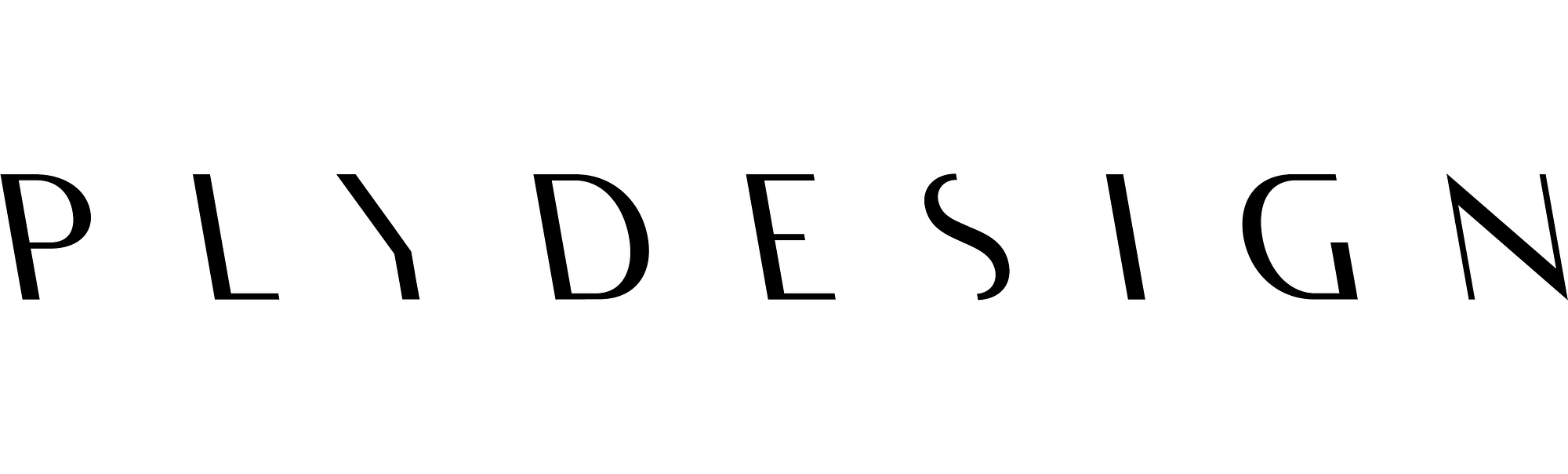
Logo is the message
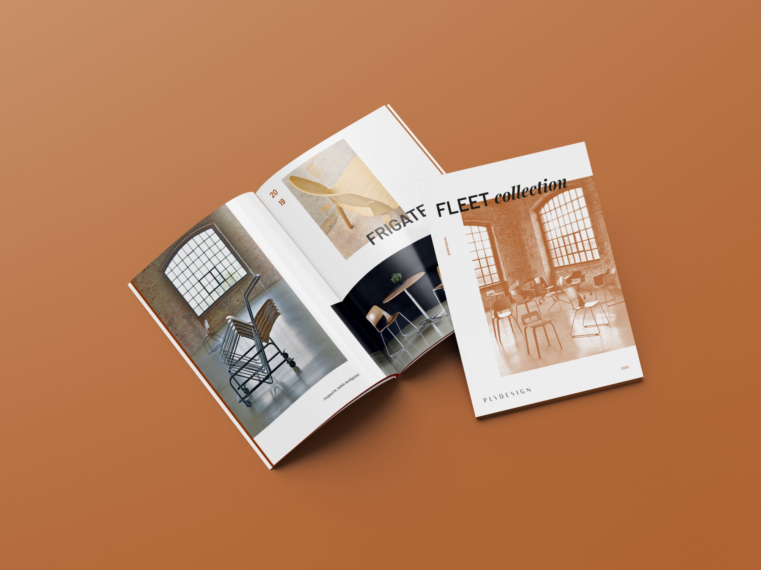
The logo expresses the idea of consistent quality, reliability and clarity - it features all the hallmarks which Plydesign products and its mission embrace. The finely engraved, thinning and thickening strokes evoke the soft curves of Plydesign furniture, and, in their striking character they radiate strength and endurance, just like the pieces in FLEET collection.
Unusually, the logo tilts to the left, equal to the angle and direction of the back of Plydesign chairs. The progressive typography reflects the dynamism of the energetic and young team that responds flexibly to changing circumstances. This kind of agility relying on personal communication and relationships, and tackles the complex problems arising in an innovative way.
This adaptability inspired two versions of the logo: the PLY logo behaves as an inherent part of Plydesign’s visual identity in any kind of environment, representing the brand’s spirit in the abbreviated version as well.
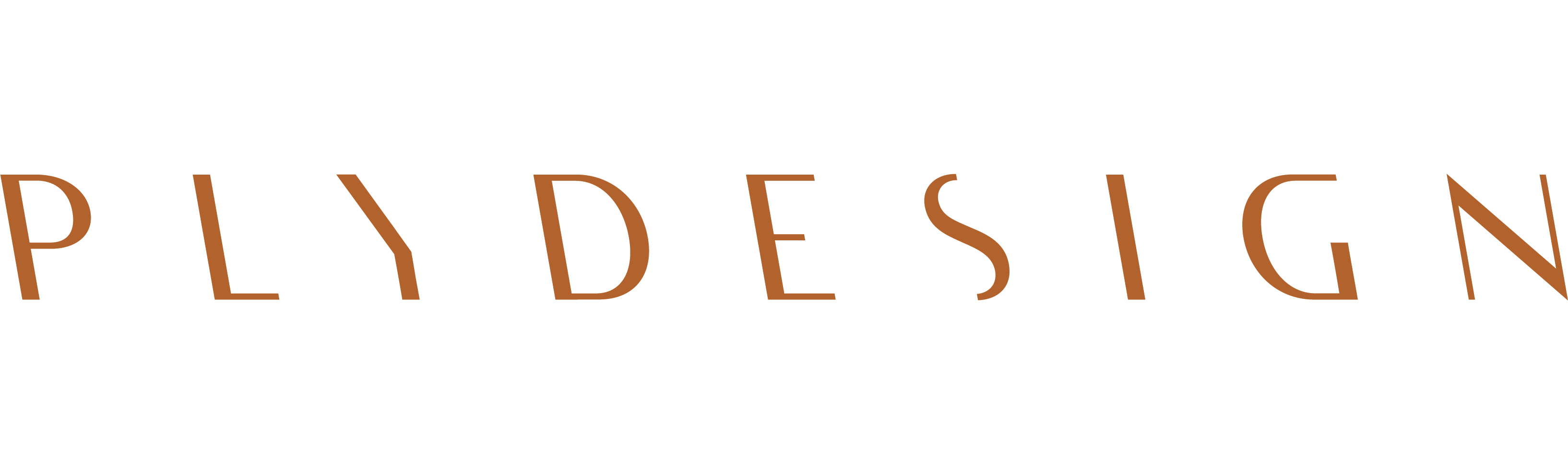
Ballad of opposites
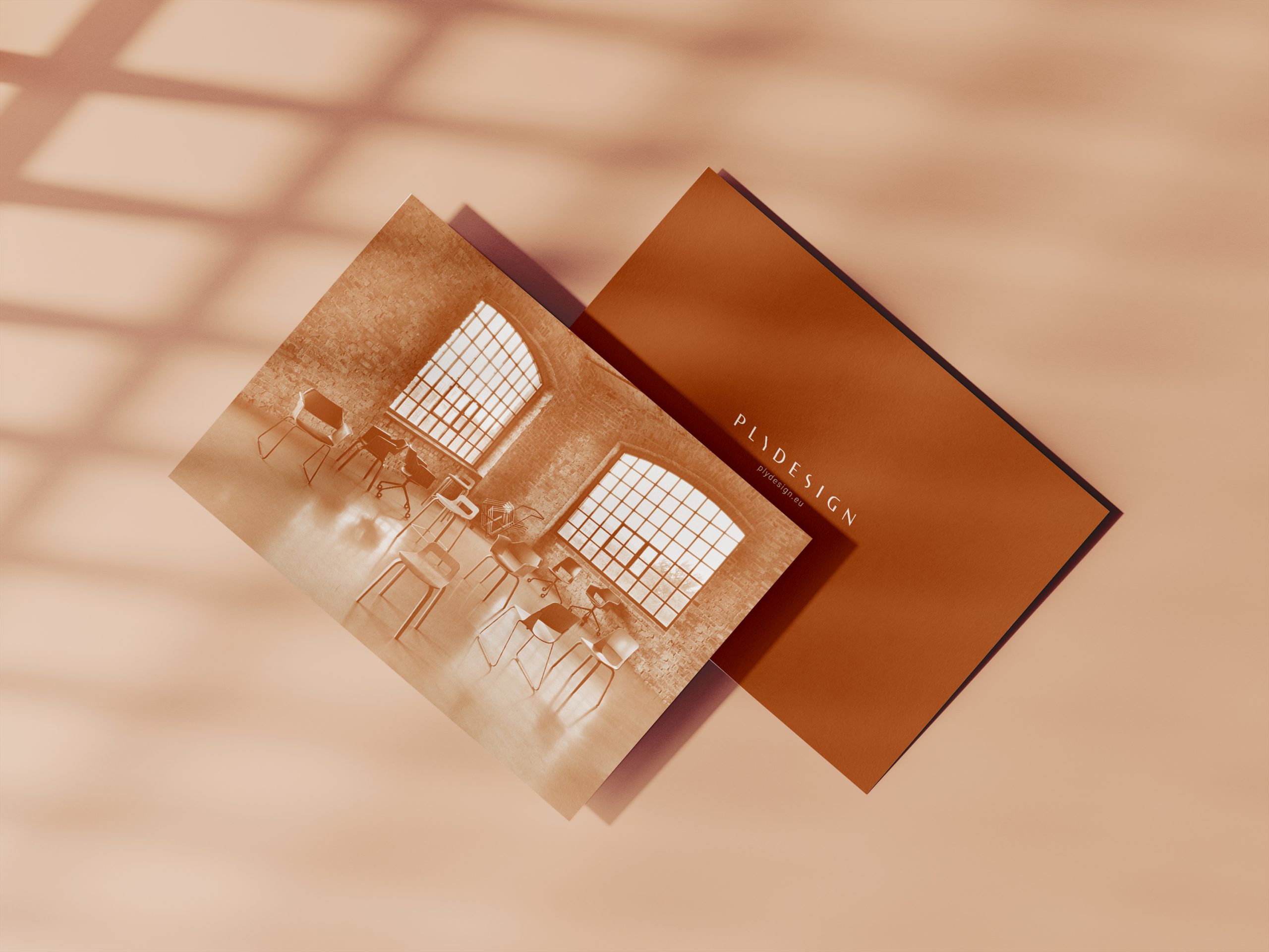
In addition to the black and white display, tobacco leaf brown and a shade of peach colours were chosen because they adequately express the soft, airy, delicate lines and sensitivity, as well as the warmth, sturdiness, and timeless hardness firmness of the wood. This kind of contrast is meant to represent the style of Plydesign, where, in addition to the almost immaterial silhouettes, chairs and tables are also included in the durable, solid determination.
Studio in Budapest
Due to the epidemiological emergency, the rebranding’s elements can only be contemplated in cyberspace, but we are also expected to receive those interested in our studio in Budapest at the beginning of September, where our new identity will appear in its physical reality. Details of the planned opening and launch for the general public will be reported on our social media channels and website.